Autonomous DEM
Synthetics for a Mobile User
Table of Contents
Synthetics for a Mobile User
Application Experience Trend
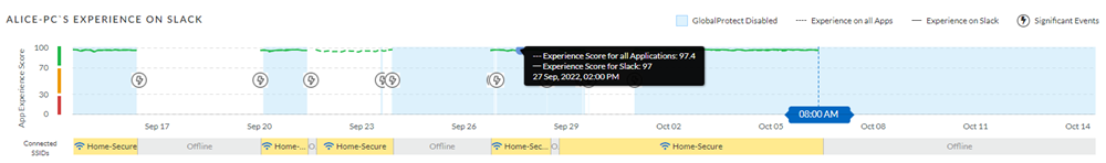
- <device>Experience on <application> - View the trend lines for all apps as well as for the selected app and see where the selected app stands in comparison to the rest of the apps running on the device. This graph also shows you the status of your GlobalProtect connection along with visual markers of the duration when the GlobalProtect connection was lost. You can see the GlobalProtect status by hovering your mouse cursor over a Significant Event symbol.
![]()
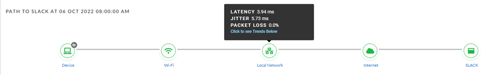
- Path to <application> - This chart allows you to quickly pinpoint which segment of the end-to-end experience is likely causing the issue for the user. Click on a segment, such as Device, WiFi, Local Network, Internet, Prisma Access, or the app name, to view the associated data for that segment in the Trends, Path Visualization, or Device Details tabs below them.
![]()
Trends tab
This tab shows you the following metrics:
- Application Performance Metrics
Metric Description Availability Application availability (in percentage) during the Time Range. DNS Lookup DNS resolution time. TCP Connect Time taken to establish a TCP connection. SSL Connect Time taken to establish an SSL connection. HTTP Latency Time taken to establish an HTTP connection. Time to First Byte The total of DNS Lookup, TCP Connect, SSL Connect and HTTP Latency time results in the Time to First Byte. Data Transfer Total time taken for the entire data to be transferred. Time to Last Byte Time to First Byte + Data Transfer time. - Device Health Metrics
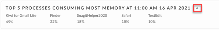
Metric Description Memory Memory used by the device at a particular time in the Time Range. Hover over the trend line to see the average amount of memory the device used during the Time Range. CPU CPU power used by the device at a particular time in the Time Range. Hover over the trend line to see the average amount of CPU the device used during the Time Range.. Battery Hover over the trend line to see the amount of battery power the device is using at any point during the Time Range. Disk Usage How much of the hard disk space has been used. Hover over the trend line to see the amount of disk space in use on the device during the Time Range. Disk Queue Length The number of outstanding requests that are waiting to be sent to the disk, a high number implies poor performance. - Top 5 Processes Consuming Most Memory and
Top 5 Processes Consuming Most CPUThe Top 5 Processes Consuming Most Memory and Top 5 Processes Consuming Most CPU widgets display the 5 processes that consume the most memory and CPU on a user's device. These widgets are not dependent on the Self-Serve feature being enabled or disabled. The numbers displayed here are an aggregate of all samples taken during the selected Time Range. Refer to the section on the Time Range Filter for details on the frequency of data samples collected. They list each process by name and how much memory or CPU the process was consuming at the selected time. You can collapse these widgets by clicking on the arrow next to the widget title.
![]()
- Top 5 Processes Consuming Most Memory and
Top 5 Processes Consuming Most CPU
Path Visualization tab
This tab shows you the hop-by-hop network details of the traffic flow from the user
to an application. Even if your VPN is disabled, it will provide visibility on all
the internet hops from the user to an application. If your application (private
application) is not reachable from an untrusted network when the VPN is disabled, it
will fail the availability test and the application experience for that session will
be impacted.

Device Details tab

Zoom Integration tab
This tab is visible only if you have purchased and enabled the Zoom QSS from Zoom.
For details on the widgets in this tab see Zoom Performance Analysis for Mobile Users.