IoT Security
Vulnerability Overview Dashboard
Table of Contents
Expand All
|
Collapse All
IoT Security Docs
-
-
- Firewall Deployment Options for IoT Security
- Use a Tap Interface for DHCP Visibility
- Use a Virtual Wire Interface for DHCP Visibility
- Use SNMP Network Discovery to Learn about Devices from Switches
- Use Network Discovery Polling to Discover Devices
- Use ERSPAN to Send Mirrored Traffic through GRE Tunnels
- Use DHCP Server Logs to Increase Device Visibility
- Control Allowed Traffic for Onboarding Devices
- Support Isolated Network Segments
-
Vulnerability Overview Dashboard
The Vulnerability Overview dashboard helps you understand your vulnerability
landscape.
| Where Can I Use This? | What Do I Need? |
|---|---|
|
|
The Vulnerability Overview dashboard (VulnerabilitiesVulnerability Overview) lets you customize how information about vulnerabilities and
vulnerability instances is presented so you can view their impact on your devices from
different perspectives. By setting filters, you determine the scope of the information
displayed, and by defining queries and settings, you control the types of
vulnerabilities and the types of devices you want to see.
The filters you set at the top of the page do not affect the
Vulnerabilities of Interest section. The vulnerabilities displayed there are determined
by the settings you configure within that section itself.
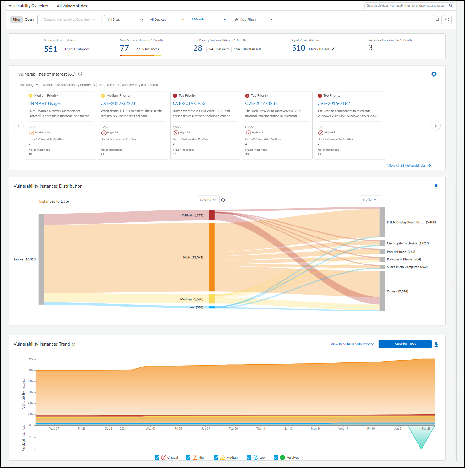
The dashboard consists of four main sections to help you easily see key statistics,
identify top vulnerabilities of interest, gain insights into their distribution among
different groups of devices, and track vulnerability instances trends.

At the top of the page is a summary of key vulnerability statistics within the parameters
defined by the filters for sites, device category, and time range.
- Vulnerabilities to Date – This is the total number of vulnerabilities detected since you began using your IoT Security tenant.Although IoT Security retains security alerts in its database for up to one year, it does not impose this time limit on vulnerabilities. If you've been using IoT Security longer than a year, it will continue showing vulnerabilities detected more than a year before.
- New Vulnerabilities in <time range> – This is the total of vulnerabilities that were detected within the time range specified in the data filter at the top of the page.
- Top Priority Vulnerabilities in <time range> – This is the total number of vulnerabilities that IoT Security prioritized as "Top". (There are also "Medium" and "Low" priorities.) It's followed by the number of instances for these vulnerabilities and the number of critical assets they affect. If you click one of the links here, IoT Security opens All Vulnerabilities with filters applied to show only top-priority vulnerabilities within the site, device type, and time range set on Vulnerabilities Dashboard.
- Aged Vulnerabilities – This is the total of all vulnerabilities that remain unresolved beyond the specified time range (30, 60, 90, or 180 days).
- Instances I resolved in <time range> – This is the total of vulnerability instances that were assigned to the person currently logged in and which were resolved during the time range specified in the data filter at the top of the page.
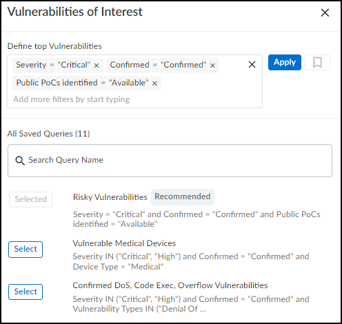
Vulnerabilities of Interest – Define criteria for vulnerabilities
that matter most to you. IoT Security will then display the top ten vulnerabilities in
response to your query with the most severe CVSS scores and those affecting the most
device profiles displayed first. For example, if you want to see vulnerabilities for a
specific vendor or profile that were detected within the last week, click the gear icon
(
 ) and configure a query to show the vulnerabilities that
interest you. IoT Security then displays the ten most severe vulnerabilities with the
broadest impact that match your terms.
By default, IoT Security uses the predefined "Risky Vulnerabilities" query to search for
confirmed critical vulnerabilities for which a proof of concept (PoC) is publicly
available. You can edit this query to define other attributes of interest and then click
the bookmark icon (
 ) to save
it for reuse.

Vulnerability Instances Distribution – The Sankey chart lets you
see the distribution of vulnerability instances across different groupings of devices.
Reading the chart from left to right, you start off on the left with all the
vulnerability instances that match the site and device category filters at the top of
the page. (Regardless of the time range filter set for the page, this chart shows all
vulnerability instances to date.) The chart then relates these instances to a type of
grouping in the middle and relates these again to another type of grouping on the right.
The choices for these groupings are Severity,
Vulnerability Type, Status,
Device Type, Device Category,
Profile, Vendor, Exploit
Status, Attack Vector (the type of access
required to exploit a vulnerability, as defined in a CVE), and Vulnerability
Priority (Top, Medium, Low). Vulnerability instances are distributed
vertically in the chart by severity (when Severity is the chosen grouping), priority
(when Vulnerability Priority is chosen), or by instance count (for all other types).
Those groupings with the highest severity, highest priority, or most instances are at the
top of the chart. When there are more than five groupings, the Sankey chart shows the
top five and then gathers everything else in an "Others" group. Hover your cursor over
Others to see a list of the next ten groupings, and click
View all to see a pop-up panel with a complete list.
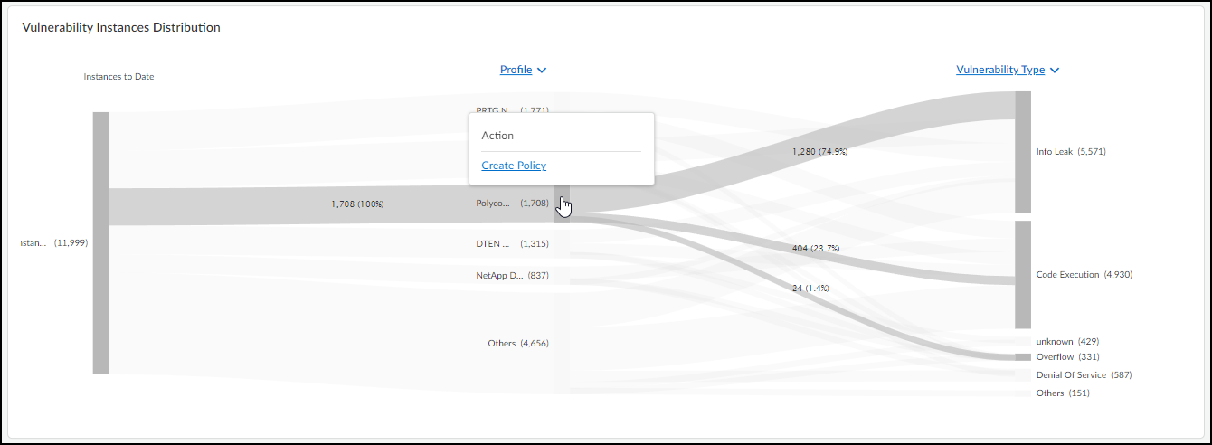
When you use Profile to group instances and then hover your cursor
over an area on a post for a particular profile, IoT Security displays an Action pop-up
panel that lets you create a set of recommended policy rules with this
profile as the source.

When you click Create Policy, IoT Security opens AssetsDevices>
profile-name
> Create New Policy Set. From there, you can modify the
automatically generated policy set if necessary, save it, and then activate it for
firewalls to import.
For example, to see the ratio of vulnerability instances among different device profiles
and different vulnerability types, choose Profile for the middle
post and Vulnerability Type for the right post. The gray bands
between the left and middle posts show how many instances pertain to each of the top
five device profiles, and the gray bands between the middle and right posts show how
many instances in each profile belong to different vulnerability types. Each band is
labeled and shows the total number of vulnerability instances per profile (on the left)
and for that profile per vulnerability type (on the right). The width of the bands lets
you see at a glance the relative quantities of vulnerability instances. Hovering your
cursor over a section of a post shows the percent of instances for the adjacent
bands.
Colors only convey meaning to denote vulnerability severity levels: red = critical,
orange = high, yellow = medium, and blue = low. For other types of groupings,
semi-transparent shades of gray are used solely to distinguish one band from
another.
To download the data from the Sankey chart for your records or reports, click the download
icon (
 ) in the upper right above the chart. IoT Security saves it as an .xlsx file with vulnerability instance distribution information
on the first sheet and a complete list of vulnerability instances on the second.
Vulnerability Instances Trend – The Instance Trend chart displays
a cumulative count of vulnerability instances over the specified time period and a daily
noncumulative count of resolved instances. This visually shows vulnerability instance
trends to help vulnerability management teams see if the number of vulnerability
instances has been increasing or decreasing over time. You can view data presented
either by vulnerability priority (Top, Medium, Low priorities) or CVSS score (Critical,
High, Medium, Low). Use the toggle on the right above the chart to switch between the
two views. When using the CVSS score view, the chart also displays data for resolved
vulnerability instances, which can help teams gauge their progress in regard to
vulnerability resolution. Hover your cursor over different points on the chart to see
the number of vulnerability instances with different priorities or CVSS scores for
different dates.
To download data from the Instance Trend chart for reports or records, click the download
icon (
 ) in the upper right above the chart. IoT Security saves it as an .xlsx file with the number of vulnerability instances to date
and resolved instances over the specified period of time.
