IoT Security
Utilization Information Panels
Table of Contents
Expand All
|
Collapse All
IoT Security Docs
-
-
- Firewall Deployment Options for IoT Security
- Use a Tap Interface for DHCP Visibility
- Use a Virtual Wire Interface for DHCP Visibility
- Use SNMP Network Discovery to Learn about Devices from Switches
- Use Network Discovery Polling to Discover Devices
- Use ERSPAN to Send Mirrored Traffic through GRE Tunnels
- Use DHCP Server Logs to Increase Device Visibility
- Control Allowed Traffic for Onboarding Devices
- Support Isolated Network Segments
-
Utilization Information Panels
The information panels in the Utilization dashboard provide
visual representations of medical IoT device utilization statistics.
| Where Can I Use This? | What Do I Need? |
|---|---|
|
|
The Utilization dashboard contains various information
panels. The types of panels differ depending on the medical IoT
device category filter you select.
Data does not immediately appear in the Utilization dashboard.
It requires a minimum of 24 hours to collect enough data to populate
the information panels with meaningful data.
Trend – The Trend information panel displays graphs that
help you spot trends in the way your devices are being used.
For medical imaging devices, the Trend panel shows two graphs. The line graph shows the number of
images taken at intervals throughout the period set as the time filter. The bar graph
shows the total case studies created during the same period. At a glance, you can see
patterns of activity and any periods of lulls and spikes. Hovering your cursor over a
data point shows the number of images and case studies at that point. If you only want
to see one chart or the other, click Images or Case
Studies in the upper right corner of the Trend panel to show or hide
them. If you want to focus attention on one graph but not completely hide the other,
hover your cursor over Images or Case
Studies to cause the other one to fade.

For infusion systems, the Trend panel displays a line graph to track the number of systems in use
and the number connected to the network (online) but not necessarily in use. If all
connected infusion systems were both connected and in use, the two lines appear to be a
single line because all their data points align. However, if you hover your cursor over
Devices Used or Devices Online Only in
the upper right corner of the Trend panel, you can show or hide one line or the other.
Hover your cursor over a data point to see the number of devices that were used and
those that were connected at that point.

The number that appears to the left of the chart is not an overall total. It shows how many
infusion systems were used today, using the most recent time for which a total can be
calculated.
Imaging Scan Analysis – This panel summarizes the sections
of the human body that were scanned by imaging devices. It is shown
for all DICOM devices except ultrasound equipment, which doesn’t
identify scanned body parts in its traffic.
The panel is divided into two sections. On the left is a human
figure consisting of four major anatomical regions:
- Head and Neck
- Upper Extremity
- Trunk
- Lower Extremity
There is a fifth grouping called "Other". This is for scans
that are unidentifiable.
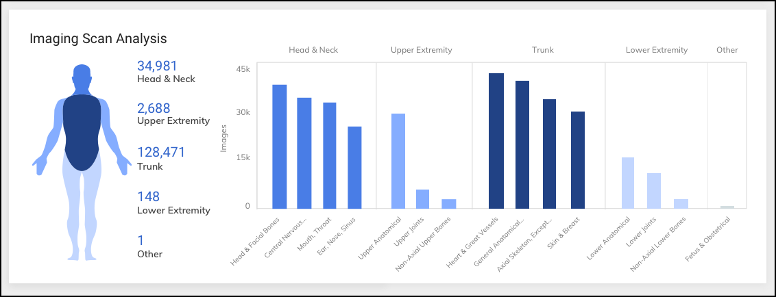
The coloring of each body region represents the volume of scans
performed on it. The darker a section is the more scans were done
there.
On the right are five bar charts, one for each of the four major
anatomical regions and a fifth for the Other grouping. Chunking
the data in this way makes it easier to see how your imaging equipment
is being used. The bars in each chart represent the number of scans
for more specific body areas (for example, a bar for the more specific
Mouth and Throat is within the bar chart for Head and Neck). The
charts include bars for areas where the most scans were performed.
To see a full list, hover your cursor over one of the main sections
and a popup appears.
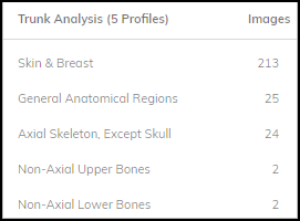
Devices – This information panel shows the total number
of devices on the network in the past year and how many devices
were connected to the network and used, connected but not used (online
only), and disconnected (offline) during the filtered time range.
- Used – These are devices that matched all the filters and were not only on the network but sent traffic with a protocol indicating that they were being used.
- Online Only – These are devices that matched all the filters and were detected on the network but did not send traffic that indicates they were being used.
- Offline – These are devices that IoT Security detected on the network within the past year but not during the time range set in the time filter.

Click a section of the donut graph or a tab heading to switch
lists. Click View all <number> devices to
open the Devices page with a filter set to show only the devices
in the active list. Click a specific device name to view device
details for it.
When you click an entry in the Device Name column, the Device Details page for it opens. While
viewing the Device Details page, click Utilization to see more
detailed information.
The Utilization section on the Device Details page for any imaging device such as an ultrasound
machine, X-ray machine, or CT scanner, shows when that device is and is not being used,
how it's being used, and when it communicated with the device vendor. For example, with
the time filter set to 1 Month at the top of the Device Details page, the Device Usage
by Hours information panel shows the times when the device was in use during the past
month.
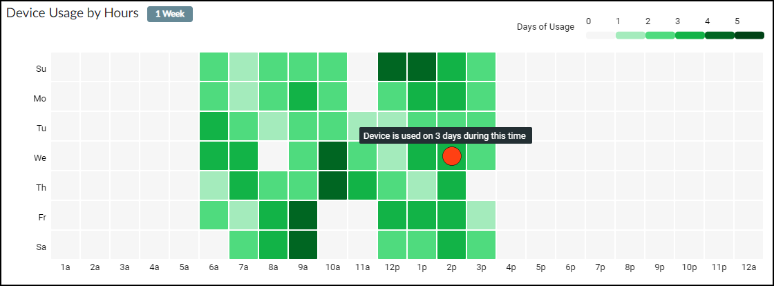
The legend in the upper right explains how the colors indicate
how much the device was used at each hour. The darker the green,
the more it was used. You can also hover your cursor over a square
to see a tooltip explaining how often the device was used at that
time. For example, in the image shown above, the device was used
three times on Wednesday during the 2:00 PM hour.
The legend is dynamic based on which time range you selected:
for 1 Week, it’s 0–1, for 1 Month it’s 1–5, and for 1 Year it’s
0–40+.
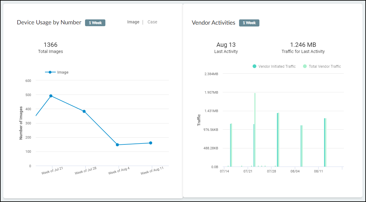
In Device Usage by Number, you can see the number of images the
device took–or, by clicking Case, the number
of cases for which the device took images. In Vendor Activities,
you can see when the device communicated with its vendor, which
for many devices is an automated means for obtaining software and
security updates. You can see the traffic that the vendor initiated
and total vendor traffic, which is a superset of all communication
between the device and the vendor regardless of which one initiated
it.
When viewing the Utilization section on the Device Details page
for an infusion system, the IoT Security portal displays the following
information.
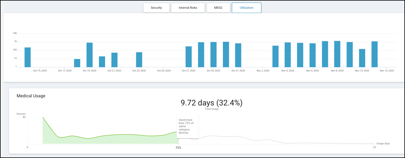
The blue bars in the upper graph, show how long the device was
in use. For 1 week, 1 day, or 2 hours, each blue bar indicates the
number of minutes per hour (60 minutes maximum) that the device
was in use over the past 168, 24, or 2 hours. For 1 month or 1
year, it shows the number of minutes per day (1440 minutes maximum)
that the device was in use every day for the past 30 or 365 days.
The lower graph shows how this device compares with others in
the same device category. You can see how long it was in use and
the percent of time it was actively used in relation to the time
range set. In the example above, it was used for 9.72 days divided
by 30 days or 32.4% of the time. The line graph shows that out of
42 devices in the same category, this device was used more than
72% of the others (indicated to the left in green) and less than
the remaining 28% (indicated to the right in white).
The following site-specific information panels appear only
when you’re using IoT Security for multiple sites.
Used Devices by Site – These bar charts show how many
medical IoT devices were used at each site within the filter parameters.
The number of devices that were in use during the filtered time
range is shown in relation to the total number of devices at each
site over the past year.

If you filter the dashboard to show data for a single site, this
panel shows not only the devices that were in use at this site but
also other sites that had active devices to provide a reference
for comparison.

Scanning Data by Site – When the medical IoT device category
is for imaging devices, this information panel shows the number
of scanned images and cases for each site with active devices. Click Cases or Images to
toggle between them.

If you filter the dashboard to show data for a single site, this
panel shows not only scanning data for this site but also other
sites that have scanning data to provide a reference for comparison.
Average Usage by Site – When you set Infusion
System as the medical IoT device category filter, this
information panel shows the average device usage at each site. The
average is calculated by dividing the total number of hours that
devices at a site were in use during the time filter (1 week, 1
month, or 3 months) by the total number of devices in use at that
site during the same time. Any devices that were not in use during
that time are excluded from the calculation. In short, hours in
use / devices in use = average usage.

If you filter the dashboard to show data for a single site, this
panel shows not only the average usage of infusion systems for this
site but also that of other sites with active infusion systems to
provide a reference for comparison.
